
The hillside villa in St Barths glowed in the late afternoon sun as a small group gathered around a table overlooking the water. Among them was a seasoned charter client, someone who had flown with more brokers than he could count. The conversation drifted toward travel plans, and someone asked him how he chooses a broker when trips come up suddenly.
He laughed softly and said, “Honestly, I just open their websites and see who makes it easiest to begin. That usually tells me everything.”
A few eyebrows lifted. Everything? From a website?
But in the world of private aviation—where emotion, convenience, and trust mingle in ways that transcend traditional buying logic—clients often make decisions in seconds. Not based on price. Not based on aircraft photos. Not based on the broker’s résumé.
They decide based on the feeling the website gives them. A feeling of immediacy, clarity, and modernity. Or a feeling of hesitation.
The smallest digital details can quietly make or break a booking. Here are the five most common website mistakes brokers make, and why these moments matter more than most realize.
Mistake 1: No Clear Way to Begin the Journey
One of the most subtle yet damaging issues is when a website looks beautiful but gives the visitor no obvious entry point. A client arrives with intent—they want to check a route, explore options, or start the quoting process. But instead of an elegant pathway forward, they encounter a wall of static information.
The luxury traveler does not want to search for the next step. They want to be guided into it as naturally as stepping into a lobby where the staff already knows their name.
When a site lacks that gentle invitation, clients often assume the broker operates with similar ambiguity. In luxury, clarity is a proxy for competence.
Mistake 2: Overreliance on Generic Contact Forms
Contact forms have their place, but they are rarely aligned with the expectations of high end travelers. These clients are not merely trying to “get in touch.” They are trying to start something. A journey. A decision. A conversation.
A form that looks no different than a retail inquiry page unintentionally diminishes the experience. It compresses a luxury service into the same visual language used for general customer support.
Private aviation clients look for cues that the broker understands their world. A generic form feels like an invitation written in the wrong language.
Mistake 3: Aircraft Photos Without Context or Interaction
Many broker websites showcase glossy aircraft images, beautifully lit and perfectly staged. But without context or interaction, these images float in a vacuum. They may look luxurious, but they do not guide a client toward action.
Luxury imagery should feel dynamic, not static. It should help the traveler imagine their experience, not merely admire someone else’s.
When images are disconnected from the quoting or route entry process, they become decoration rather than part of the journey. Clients leave with impressions, not intentions.
Mistake 4: Inconsistent or Incomplete Inquiry Details
Behind every great broker is a delicate choreography of communication—texts from clients, calls from assistants, emails from first time travelers. The process is intricate and often unstructured.
A website should simplify that world, not add to its complexity.
One of the biggest operational burdens brokers face is receiving inquiries that lack essential details. Missing dates. Missing passenger counts. Missing aircraft category preferences. Each missing detail becomes a back and forth exchange, which slows the momentum of the booking.
In luxury travel, momentum is emotional. When it slows, doubt enters.
Mistake 5: A Website That Feels Like Yesterday
Luxury does not merely live in appearance. It lives in timeliness. Private aviation clients have a heightened sensitivity to whether a brand feels current—whether it reflects the world they inhabit.
A site that feels dated, heavy, or slow subtly communicates the opposite of what private aviation promises. It suggests that the service might lag behind the pace of the client’s life.
Luxury, at its core, is not about extravagance. It is about ease. Ease of movement. Ease of communication. Ease of experience. A modern website is not decoration; it is an extension of the journey the broker is selling.
The Digital Touchpoints Clients Never Articulate
Clients rarely verbalize why they choose one broker over another. They speak in broad strokes:
- “It felt better.”
- “It was easier to get started.”
- “Their site just made sense.”
- “I got the impression they were more organized.”
But beneath those phrases sits a deeper truth.
The site gave them emotional reassurance.
It aligned with their internal rhythm.
It confirmed that the broker understands the culture of modern luxury.
When Digital Experience Becomes a Reflection of Service
The most successful brokers recognize their website as an extension of their reputation—not a marketing tool, but a prelude. The first soft chapter in the story a client will tell themselves about whether this broker understands them.
And in private aviation, a story that begins smoothly almost always ends successfully.
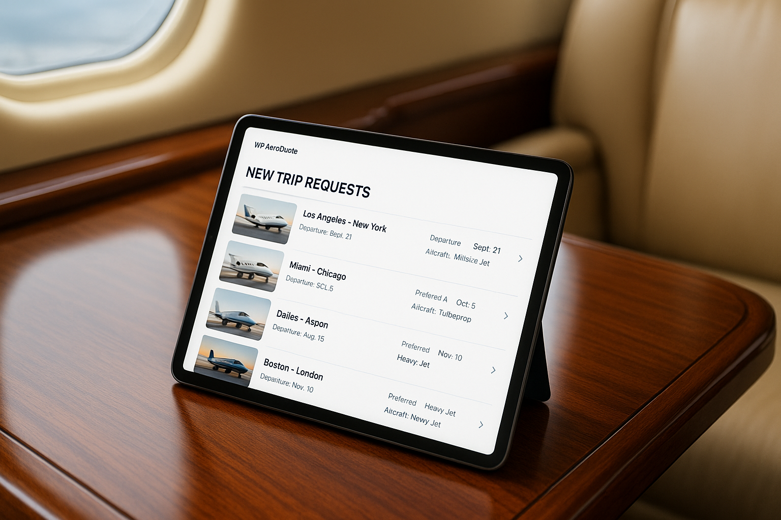
Get Started
If you want your website to capture the clients who are already looking for you, install WP AeroQuote and transform your digital presence into the elegant, effortless experience modern travelers expect. For custom aviation workflow design or luxury level digital upgrades, contact us and we will create a solution tailored to your brokerage.